For Tasha
Good Morning!
It's time to share the pocket letters that I made for my pals at Pocket Letter Pals during the month of August. I'm also going to share the pl's my pals made for me as well so let's get started. The pocket letter above was created for my pal, Tasha, in England. It's actually the second one I made for her as the first pl was damaged in transit. Fortunately the postal system mailed it back to me just before I left for my anniversary trip in June. I contacted her and she was so gracious and understanding. Thanks Tasha!!! As soon as I returned home I made a replacement pl then promptly mailed it. It arrived in England within a week and that has to be a record!!!


I used a paper collection that has been in my stash for a while (maybe because I am hoarding it) to create it. Pink Paislee's London Market 12 x 12 paper and the alpha paper is from Prima's Romance Novel. I fussy cut stamps as well as ephemera - banners, tickets and a floral pocket to hold treasure (aka metal charms) from both paper collections. I also decided to add a die cut Sizzix Eiffel Tower, on the front of my letter and outlined it with Platinum Liquid Pearls by Ranger. Finishing touches on the pockets include fancy trim, stickers, chipboard cog wheel, a button, Prima bling, washi tape, ribbons, rub ons, metal charm tag on the spine, stamping and Ranger's Liquid Pearls. I'm happy to say she loves it! I shared her pl previously on my blog but here it is again below.
I love all the girly aspects of her letter and the color combo too!
Thanks again Tasha!
Next up is the letter I sent to my pal and friend, Katrin, in Germany. It always amazes me how much we think alike but somehow we managed to surprise each other with travel pocket letters. :)
Here's the one I made for her.
It was hard to photograph because it was bulky and the glare was impossible. Basically each pocket holds an accordion style booklet which is a mini photo album of the places we visited. Here's a photo which shows how dimensional this pl is.
They were wedged in the protective pocket covers and I worried a few wouldn't fit. ;)
This is what the back looks like.
Maybe some close ups will help with the glare...
Top Row-Photos along the drive, Canyon De Chelley National Monument in Arizona, Zion National Park in Utah
Middle Row-Kolob Canyons, Salt Lake City and Ogden, Utah, Bryce Canyon National Park
Bottom Row-Arches Nat'l Park in Utah, Ouray, Colorado and Santa Fe, New Mexico
Along the way I sent Katrin messages via Instagram and I used those photos as well. Hopefully it brings back wonderful memories of the places she visited with her husband in Utah and inspires them to come back for another visit to the beautiful southwest. I'll share quickly how I put the mini albums together as someone asked that question on Pocket Letter Pal's.
I used an acrylic accordion style album that I purchased several years ago from Taylored Expressions. I added designer paper to the front of each section with double stick tape but first I chomped the corners with the 1/2" corner rounder by We R Memory Keepers.
I added photos to the front and back writing notes on the actual photos and sometimes spelling a message out with tiny alphas.
To maximize my album I tucked photos behind and on top of (flip style) other photos.
You can see here how I added a photo on top of the bottom photo and another one on the inside of my flipped up photo.
I'm not sure if these acrylic accordion style mini albums are available anymore (each panel was ATC size - 2.5" x 3.5") but you can make your own using a piece of cardstock and a score board. Your panel needs to be 3.5" tall and for a 5 photo spread like mine it needs to be 12.5" wide. You'll score at 2.5", 5", 7.5", 10" and 12.5" then fold on each score line. You can round the corners or not, whatever you like. Truthfully it would probably work better with cardstock as the acrylic accordion albums were rather bulky once I added the photos.
Okay, now let me share the pocket letter Katrin made for me (well my hubby too).
I love it!!! The glare again is making it a bit difficult to see but you can click on any photo to enlarge. There's a lot of detail on each pocket and I love how she layers her elements. :)
The top right pocket is still hard to see. I love the paper she used which looks like a map of a national park and the buffalo embellishment and small map folded and tucked in the bottom left corner are fabulous touches. I'll have to share my up close and personal experience with buffalo in the Wind Cave National Park with you someday. ;) The two love birds on the branch (bottom left pocket) is another fave and she put our initials inside the heart. How sweet! I love the starry background and her message spelled out - Under the Stars.
On the spine she included this fun tag with the retro image of a car and vintage style camper complete with the towering red rocks of the southwest in the background. I love the metal charms and sweet little banner too. Thanks Katrin!!! I'm going to place some of our fave photos in the back of the pockets and store it with our vacation albums so we'll see it every time we look back and remember this amazing trip. :)
Next up is the most recent pl I created and it was for a butterfly group swap at PLP's. It went to my pal, Glenda, in Florida and I'm tickled that she loves it and considers it a work of art. That just made my day!
I used mixed media techniques to add several layers to each pocket. Each one started out with a resist paper from Hot Off the Press that had a butterfly motif pattern on it. When I rubbed my distress inks-old paper, tattered rose, gathered twigs, black soot-over the top the butterflies popped up. I love resist paper and it's always an easy way to make a statement. I added a variety of mediums like texture paste, stenciling, Tim's Tissue Paper-Melange-rub ons and inks. The tissue paper offered a large butterfly (bottom row, left pocket) which I love and this paper has a waxy feel to it. However it's translucent which is great for shading/adding color with my Faber-Castell Pitt Brush Pens or Tim's Distress Markers.

Since we were challenged to make some of our butterflies pop off the page I went for a 3 dimensional look. First butterfly was stamped in permanent black ink on the resist paper, then I stamped it twice on a dp from Prima's Almanac paper collection in Versamark Ink and heat embossed each one with black embossing powder by Ranger. Foam dots were added under the wings of the first embossed butterfly and I placed it directly over the stamped butterfly. I placed the other embossed butterfly on the outside of the pocket, matching it up with the other two, and this time foam tape was used on the body of the butterfly so I could bring the wings up as if he/she were in flight. This pocket was embellished with a quote, a Prima flower and rub ons.

I fussy cut several butterflies from the Almanac collection and layered them on top of each other adding dimension with foam dots/tape. You can see in the background a Pink Paislee rub on that I placed over the resist paper and also some rub on stitches (upper right) by Christy Tomlinson. I love Finnabair's mixed media products (available through Prima Marketing) and one of my fave things to do is add her micro beads to anything. For this pocket letter I added a Prima paper rose to each pocket and adorned each one with bronze micro beads by Finn. Simply mix a small amount with her soft gloss gel (or other medium like matte gel) and add with a fine tip brush where you want to place the beads. The gel medium will dry clear as you can see leaving only the beads to shine. I spelled out "with brave wings she flies" with Tim Holtz's chitchat stickers.

Since Glenda is always so gracious to include handmade beaded items I wanted to include beading on my letter to her. While I'm simply not patient enough to create beaded tassles or pretty stick pins I did pay homage by stringing these seed beads onto a strand of hemp cording and I added micro beads to each and every Prima rose. You can also see on this pocket that I used a smaller butterfly cut from the Almanac collection and laser cut wood butterflies that were altered with acrylic paint, ink and bronze Liquid Pearls. You can also see the 3 layers of resist paper, Tim's tissue paper and his lattice stencil in the background. I love the depth the layering adds as well as rub ons.

The piano keyboard is ephemera from the Almanac collection as well as the mini stamps on the different pocket letters. Prima bling was added to 3 of the pockets and I used rub ons from Kaisercraft, Pink Paislee, Christy Tomlinson and Tim Holtz on the various pockets. Butterflies mean "new beginnings" so I had to stamp this Taylored Expressions sentiment on a hand cut banner. For my inks I used Tim's Distress Inks in the above mentioned colors. The music notes are actually from Tim's Melange Tissue Paper and I adhered it with matte gel medium by Liquitex.

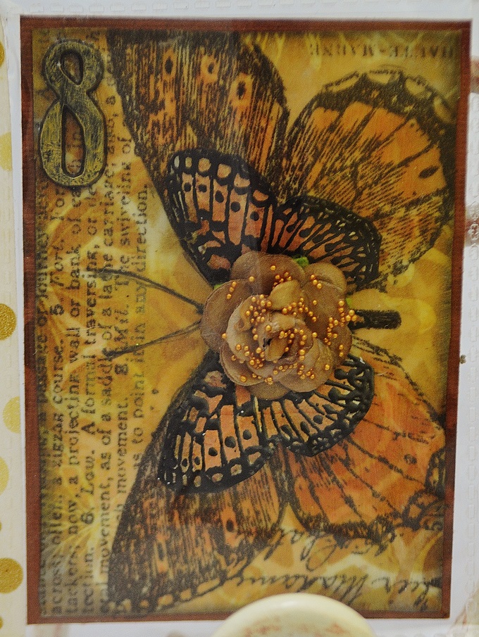
The number 8 means "new beginnings" so I wanted to include it on my letter for Glenda. You can see (white lines) the lattice stencil by Tim Holtz peeking through the background. I placed this large butterfly from the tissue paper on my resist paper vertically so I could capture most of it. It's colored with Distress Markers and I stamped a butterfly image with Versamark ink onto a dp from the Almanac collection then heat embossed it. It was popped up on foam dots for dimension and placed on top of the tissue butterfly and I added a Prima rose in the center. I love that the tissue paper dries translucent so you can see the design beneath it as well as the text, script writing and butterfly on this sheet. Tim Holtz is a creative genius indeed!
Here's is Glenda's butterfly pocket letter to me and being someone who loves color......well I simply love it. The butterflies are gorgeous and I love the banner she made along the spine.
I'm not sure where she got all of her images from but they are so pretty in person. The blue is vibrant and jumps off the page and I love the beaded tassle as well as the handmade stick pins (not shown) she always includes. I admitted to her that I am hoarding them. :) Sorry folks but no way am I passing those treasures on. I'm planning to use them on future mini albums I want to create if things ever calm down a bit. I also got a chuckle out of her saying I looked too young to become a grandma soon in my note I included for her. It might be time for me to update my profile photo lol because this time next month my grandson should be here. I'm just a wee bit excited to become a "Mimi" and even more excited to hold that precious bundle in my arms for the first time. :)))))
Sorry, I got off track...here's a mini collage of this pretty pocket letter before I close today.
She's added sunflowers (which I love) crochet lace, sequin trim, my initial, and a yellow and white fancy trim....just so many details that are hard to miss if you don't take a closer look. The image of the cluster of butterflies (middle pocket, bottom row) is stunning in person. I love winged things and I'm currently working on another pl with this theme. Upon receiving this one from Glenda last week I decided to go with vibrant colors as well. After all, summer is nearly over and the butterflies will be leaving soon then everything will turn golden.
A big thank you to all of my pals for the wonderful goodies they included with my pocket letters and for those special handmade gifts that will be cherished always. ;)
Thanks for the visit today!
Hugs,
Lisa