Tuesday, March 31, 2015

Mellow Yellow


I'm sharing an Easter tag that I created for the new challenge at Top Tip Tuesday, which I am hosting by the way. We hope you'll join us for our Mellow Yellow challenge. Use yellow on your project and you're good to go. Need some inspiration, visit the DT's creations by clicking on their links (on my right sidebar) or visit the TTT blog. You'll also want to check out the beautiful inspiration by our Guest Designer and Deneen's fabulous Dresser Side-Step Card tutorial. 


Prize is a $12 gift card to the online store.


I've got a few close ups of my tag to share.

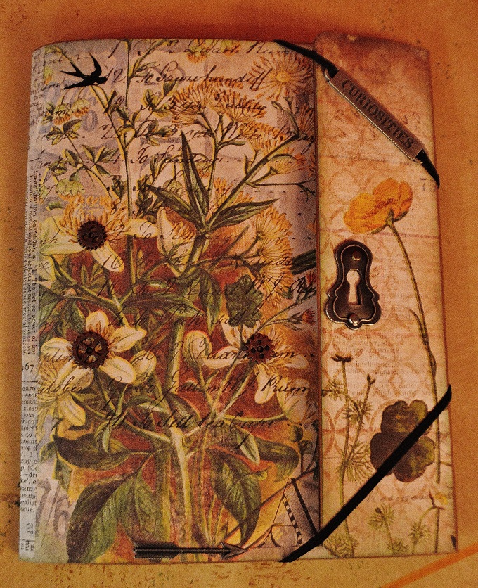
As you can see there are many shades of yellow on my upcycled Graphic 45 packaging which I used to create this tag. The butterfly was embossed with Ranger's Ochre Antiquities embossing powder and Buttercup Liquid Pearls add a nice border.

I layered crochet trim with two ribbons and pale yellow seam binding was added to the top of my tag. A pretty My Mind's Eye brad adds a nice floral touch.

That's gathered crepe paper by Glitz behind my focal image and a beautiful butterfly rub on by Bo Bunny was added to the bottom right corner. My sentiment is from Taylored Expressions.


It's hard to believe that Easter is this coming Sunday! I don't know how you feel but for me this year has literally flown by. Thanks for dropping by today and I hope you'll join us for our Mellow Yellow challenge.

Lisa xx 


Friday, March 27, 2015

Spring Inspired Tag


24.Header

Remnant Rub Resist

features one of my favorite Idea-ology products by Tim Holtz. 

Inspiration for my tag came from the early signs of spring here in my corner of the world. 

Hope you like it!


The Funkie Junkie is generously offering a 

The Funkie Junkie Boutique

$25.00 gift certificate to one lucky CC3C'er.


We're following along with the technique challenges in Tim's Compendium of Curiosities III book and you can obtain an autographed copy here


Here are a few close ups of my tag...


I used Botanical Remnant Resist rub ons to decorate my tag and two stamps from Tim's Urban Tapestry set. The speckled dot stamp was inked with Archival Forget-Me-Not ink and randomly stamped. The bird on a branch was inked with Walnut Stain distress ink and a black fine point Sharpie adds some definition to his/her eye. The background was created with distress stains and distress inks.


That's all for me today, thanks for the visit!
Lisa xx


Friday, March 20, 2015

Easter Greetings


Hello and Welcome 

It's hard to believe that Easter is just around the corner! If you're looking for a fun way to package your treats this year check out the Easter Goodie Box Template and Cutting File from The Cutting Cafe. It comes with instructions, overlays and several design elements. 


I used a zig zag (from the file) to decorate the back.

Yellow crochet trim was added to the outer edge of the box. The pretty blossom is by Prima and I used Graphic 45's Sweet Sentiments collection for my polka dot dp, postage stamp and sentiment banner. Buttercup liquid pearls add a dotted border to the top and I inked every edge with dusty concord and seedless preserves distress ink. 


The Cutting Cafe


Be sure to visit The Cutting Cafe's blog on the 21st to view more inspiration by the design team. You can be in the running to win 3 Free Sets by leaving a comment on the DT post. Regina will announce the winner on the 7th of April. 

Have a wonderful weekend, wherever you are!
Lisa xx

Friday, March 13, 2015

Wallflower Collection Folio

Front Cover


This may be the fastest blog post I've ever written because I'm linking my project up with only 40 minutes to spare before the challenge ends. Ugh! The past few weeks...well months...actually have been rather stressful for my family. Somehow I managed every time to meet the deadline but I thought this was going to be the challenge I'd have to sit out. Well I'm happy to say that I pulled a rabbit out of the hat! While my collection folio is covered, altered and assembled it is not filled with my photos and mementos...simply ran out of time...but I did add some of Tim's relatives. ;)

23.header
We are working from Tim's third book in his Compendium of Curiosities series and if you'd like an autographed copy click here


This is what my folio looked like before I started adding pages and pockets. Actually this is the small collection folio and as you can see you have ample space to create a keepsake book. .

A close up of the spine. I used papers from Tim's Wallflower 12x12 paper collection. I love these papers!!! All of the elements added are by Tim and I particularly like the industrial stickers.

Inside left panel, there's a pocket with a mini journal that's filled with pockets for storing photo's, letters, mementos etc. 

The top outer flap. The arrow points to a hidden pocket. 

This is the inside of the top flap.

This is the outer lower flap (what you see when you open the folio).

The lower flap folds down to reveal a pocket and another hidden pocket at the top. I'm kinda fond of those. :) 

What the finished folio looks like opened up. 

You can see some of Tim's found relatives peeking out. :)
Hopefully I'll be able to add a few more detail photos on Monday (I'm currently out of town) so you can see what my pages, tags and pockets look like.

I used several Idea-ology products in making my folio and every edge was inked with bundled sage, frayed burlap or gathered twigs distress ink. The only non Tim Holtz item used was Martha Stewart's Lace Doily border punch. 


This challenge is sponsored by The Inspiration Emporium and they are generously offering the lucky CC3C winner a prize of 

 iegc50


That's all for me tonight, I'm off to visit the Curiosity Crew and leave some love. 
Have a great weekend everyone!
Lisa xx


Friday, March 6, 2015

Shades of Green


Hello and Welcome!

Regina, owner/designer of The Cutting Cafe, gave the design team the freedom to create anything we wanted but it had to be green. I knew what I wanted to create-a St. Patrick's Day themed matchbook. There are several matchbook files, which you can print and cut, that are available here in the online store. 


I inked all of my surfaces with peeled paint distress ink and used gathered twigs distress ink on the edges. Two Graphic 45 paper collections-Time to Flourish and Place in Time-decorate my matchbook along with flowers, stickers, and pearls.

I added paper to the inside as well. A nest of green moss will provide a soft landing for the four leaf clover locket which I'll place in my matchbook as a St. Patrick's Day gift for my daughter. 


The Cutting Cafe


Hope you like my little matchbook. To see more "green" inspiration featuring cutting files/templates/printable stamps by The Cutting Cafe be sure to visit TCC blog on the 7th. If you leave a comment you'll be in the running to win 3 FREE sets from TCC. Good luck!


Have a wonderful weekend, wherever you are!!!
Lisa xx

Tuesday, March 3, 2015

Birthday Wishes


I'm popping back in to post another card today that I created for my sister's birthday today. She's a Graphic 45 fan like me so I thought she'd appreciate a card featuring one of their fab paper collections. She loved it and that makes me happy. :) 
Happy Birthday Cyndy!!!

Before I go any further I want to note that I was inspired by a card I saw on the Graphic 45 blog. It's a close CASE with a few differences and if I could find it again I'd link up to it. Here's the link to the G45 blog and I have it Pinned to my Graphic 45 Inspiration Pinterest board as well.

A few close ups...

I added a grosgrain bow at the top which differs from the original. The flowers and butterfly were fussy cut from the Botanical Tea G45 collection.

I didn't have a chipboard label so I created my own by die cutting a My Favorite Things Vertical Greetings II die and layering a Spellbinders Labels 14 on top. I stamped a coordinating Holidays Labels 14 stamp, in broken china distress ink, by Waltzingmouse Stamps. A birthday sentiment from Verve Stamps-Big Wish set was stamped in Archival Sepia ink and a clock  brad by Prima secures it in place.  

I added more fussy cut butterflies and a row of floral stamps at the bottom. Prima bling was added to the flower centers and butterflies. All of my edges were inked vintage photo distress ink.


Thanks for looking! 
I'll be back later in the week to share a DT project for The Cutting Cafe.
Lisa xx

Lights, Camera, Action


- Use an Action Image -

We have a new challenge for you at Top Tip Tuesday and I love the theme. I took a different approach than using an action image or using a moving part on my DT card though. Rather, I stamped an image that involves action and I couldn't resist using Lights, Camera Action which I spelled out with tiny type alpha stickers. I added a tag and small filmstrip from G45's Communique collection,Tim's Idea-ology filmstrip and mirrored star (which I altered with Ginger Adirondack alcohol ink). 

To see some amazing inspiration for this challenge be sure to visit the blogs of my teamies. Their links are on my right sidebar. 


Prize is 2 digi's of winner's choice. 


I'll be back later today to share another card. See you then!
Lisa xx


Related Posts Plugin for WordPress, Blogger...