

Hi there, I'm dropping in to post this card I made this afternoon while taking a break from the heat. I love the colors of the CR84FN55 Color Challenge so much that I wanted to make another card using the fabulous challenge colors. While searching for a sketch I happened upon a challenge {serendipity part} that I couldn't pass up. One of my goals this year was to try new techniques and thanks to the current Just Us Girls Challenge (JUGS) I can check the Acrylic Distress Technique off my list. In their challenge post they've included a link to Beate's tutorial at SCS and I hope you'll check it out. With the colors and the technique down I searched for a sketch and the current Retro Sketches #15 was perfect. I rotated the sketch and I added an inset panel to my base so my ribbon would tuck neatly underneath, otherwise I remained true to the sketch by the uber talented Laurie.


On a quick note I stamped my image onto vellum, let it dry and die cut it. I die cut two more pieces of white cs, one to back the image and another for my embossed panel. You can see how I did the technique if you visit the JUGS link and I inked the edges of the inset panel with celery just to make it stand out. A polka dot ribbon brings lavender into play in a fun way and my brads finish it off.
I'll admit that I wanted another chance to work with the CR84FN colors because last month we traveled to beautiful Colonial Historic Williamsburg and I fell in love with the gardens there. One in particular, the Governor's Palace Gardens, was absolutely breathtaking. I could not resist coming back for a second look the next day and this time I brought along my macro lens. Here's a photo, or two, from that garden. Can you see the bee in the first one?
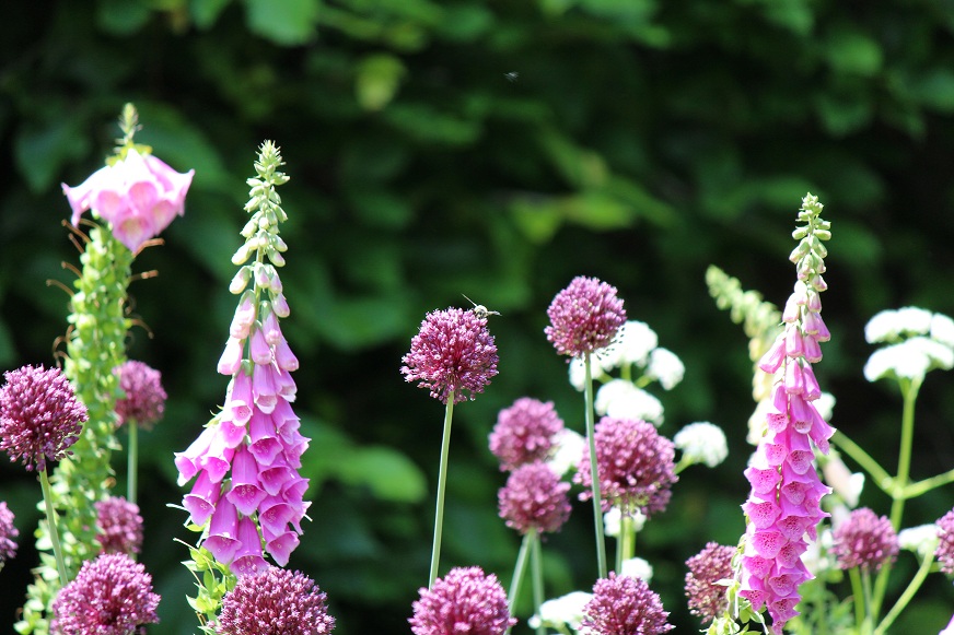

There was beauty everywhere that I'd love to share but this post is already photo heavy. Thanks for taking a look and hope the rest of your weekend is awesome! BTW, the color challenge ends today so hurry if you want to play along. Edited for correction: I missed my second entry in the color challenge because the collection closed last night but it still inspired me to make this card and I love it. The other two challenges have plenty of time so good luck. :)
~Lisa
Supplies:
Stamps: Discover Your Wings (TE)
Ink: Hyacinth, Heliotrope & Split Pea (Versa Color/Tsukineko Co.), Peeled Paint Distress Ink (T!m Holtz/Ranger)
Paper: Avalanche White cs (Bazzill Basics), vellum
Accessories: Spellbinders Labels Eight & Twenty Dies; Victoria Embossed Folder (C'bug); lavender polka dot ribbon (TE); brads (American Crafts); Silver Metallic Acrylic Paint Dabber (Ranger); 3D Foam Dots (Therm O Web); sandpaper

8 comments:
Way to rock the challenges! Wasn't this a fun technique? It was new to me too!
Oh yeah - Thanks for joining in with JUGS!
This is just beautiful Lisa, I love that distressing technique you used,mits so effective, it looks like metal! Well done!
Thanks for joining us at Cr84FN this week!
Gorgeous, gorgeous photos...I can see why you wanted to use that color palette again. Your card is beautiful! Thanks so much for playing along with us at Just Us Girls!
Your card and your flower garden are both so pretty Lisa! Great job showcasing the CR84FN colors! Thanks so much for joining along :)
Amazing clean and simple card, but not! So much detail on each individual piece; however, so crisp and refined. It's beautiful!! The colors ARE fantastic. :)
smiles,
L2
Beautiful! Love the colors and the background panel is gorgeous! Amazing pictures of the flowers too!
Lovely! I love your colors! Thanks for playing along with Just Us Girls this week.
Post a Comment